How to Create Heatmaps for Data Visualization

Heatmaps use color intensity to represent data values, making them effective for visualizing patterns across two dimensions. They are used for correlation matrices, geographic density maps, time-of-day activity patterns, and website click behavior. This article covers the tools and techniques for creating different types of heatmaps, from simple correlation matrices to interactive geographic heatmaps.
Correlation Heatmaps
A correlation heatmap shows the pairwise correlation coefficients between numeric variables in a dataset. Each cell in the matrix represents the correlation between two variables, with colors ranging from blue (negative correlation) through white (no correlation) to red (positive correlation). This visualization helps you quickly identify which variables are strongly related and which are independent.
In Python, Seaborn's heatmap() function creates correlation heatmaps in one line: sns.heatmap(df.corr(), annot=True, cmap='coolwarm', center=0). The annot=True parameter displays the correlation coefficient in each cell, cmap sets the color palette, and center=0 ensures that zero correlation maps to the center of the color scale. In Excel, you can create a similar effect using conditional formatting: calculate the correlation matrix with CORREL or the Data Analysis ToolPak, then apply a red-white-blue color scale.

Geographic Heatmaps
Geographic heatmaps (also called choropleth maps) color-code geographic regions (countries, states, postal codes) based on a data value. They are used to show regional variations in sales, population density, disease rates, or any metric that varies by location. The key requirement is a dataset that maps geographic identifiers (state names, FIPS codes, postal codes) to numeric values.
In Tableau, create a geographic heatmap by dragging a geographic field (State, Country, Postal Code) to the Detail shelf and a measure (Sales, Population) to the Color shelf. Tableau automatically generates a filled map. In Python, the Folium library creates interactive geographic heatmaps: folium.Map(location=[lat, lon], zoom_start=6) creates a base map, and folium.Choropleth() adds a color-coded overlay using a GeoJSON file that defines the geographic boundaries.
Time and Activity Heatmaps
Time-based heatmaps show how a metric varies across two time dimensions, such as day of week vs. hour of day. For example, a website traffic heatmap might show that visits peak on Tuesday at 10 AM and drop on weekends. A call center heatmap might reveal that call volume is highest on Monday mornings. These patterns are difficult to see in line charts but become immediately obvious in a heatmap.
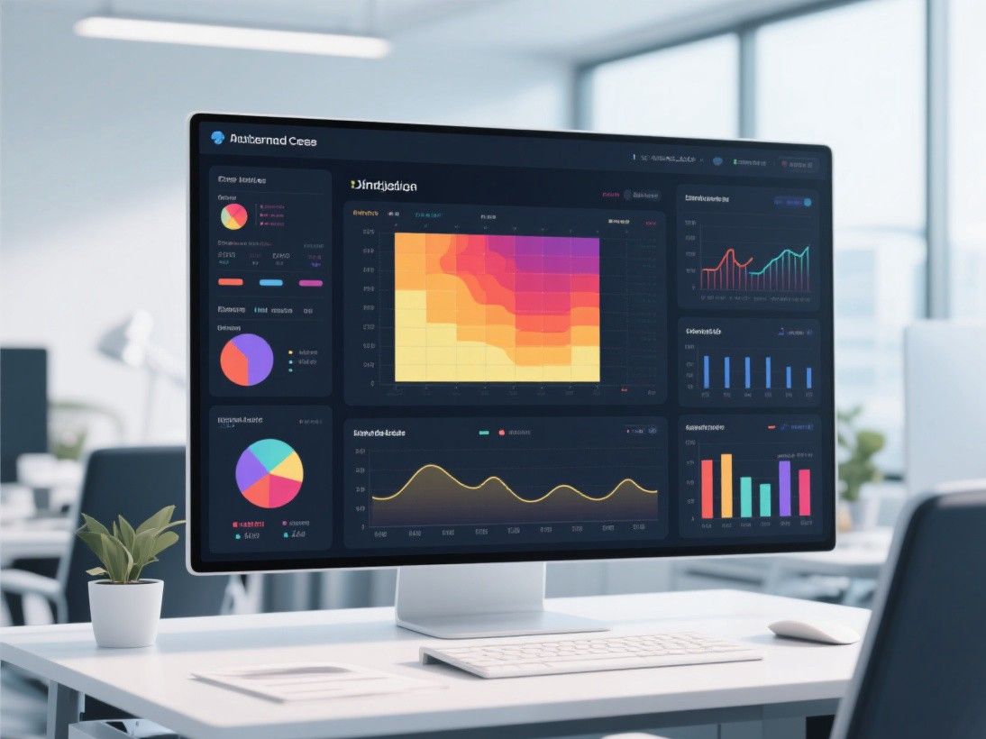
In Excel, create a pivot table with day of week as rows and hour of day as columns, then apply conditional formatting with a color scale. In Python, use Seaborn's heatmap() with a pivot table as input: sns.heatmap(df.pivot_table(values='traffic', index='day_of_week', columns='hour')). The resulting heatmap shows color intensity proportional to traffic volume, making peak and off-peak periods immediately visible.
Website Click and Scroll Heatmaps
Website heatmaps show where users click, move their mouse, and scroll on a webpage. Click heatmaps overlay colored dots on a screenshot of the page, with hotter colors (red, yellow) indicating areas with more clicks. Scroll heatmaps show how far down the page users scroll, with a line indicating the point where 50 percent, 75 percent, or 90 percent of users stop scrolling.
Hotjar and Crazy Egg are the leading tools for website heatmaps. Hotjar's click heatmap shows aggregate click data, its move heatmap shows mouse movement patterns (which correlate with reading behavior), and its scroll heatmap shows how far users scroll on each page. Crazy Egg offers similar features plus a "Confetti" report that shows individual clicks as colored dots, making it easy to see which specific elements users interact with.
Interactive Heatmaps with BI Tools
Tableau and Power BI both support interactive heatmaps. In Tableau, use a highlight table (a text table with color-coded backgrounds) by dragging dimensions to rows and columns and a measure to the Color shelf. In Power BI, use the matrix visual with conditional formatting applied to the values. Both tools allow you to add tooltips that show the exact value when you hover over a cell, and filters that let you zoom into specific subsets of the data.

For web-based interactive heatmaps, Plotly (Python library and JavaScript library) provides zoom, pan, and hover interactions out of the box. plotly.express.imshow(matrix) creates an interactive heatmap from a 2D array, and plotly.graph_objects.Heatmap() provides more control over colors, labels, and layout. Plotly heatmaps can be embedded in web pages, Jupyter Notebooks, or Dash applications.
Design Best Practices for Heatmaps
Choose a color palette that matches your data. For diverging data (positive and negative values, like correlations), use a diverging palette (blue-white-red or purple-white-green). For sequential data (values from low to high, like density), use a sequential palette (light yellow to dark red). Avoid rainbow palettes, which are perceptually non-uniform and make it difficult to compare values.
Design Best Practices for Heatmaps
Choose a color palette that matches your data. For diverging data (positive and negative values, like correlations), use a diverging palette (blue-white-red or purple-white-green). For sequential data (values from low to high, like density), use a sequential palette (light yellow to dark red). Avoid rainbow palettes, which are perceptually non-uniform and make it difficult to compare values. Include a legend or color bar so readers can map colors to numeric values. And ensure that the color scale has enough distinct levels to show meaningful differences: a palette with only 3-4 color levels may not capture the variation in your data.
For accessibility, use colorblind-friendly palettes. Approximately 8 percent of men and 0.5 percent of women have red-green color vision deficiency, so palettes that rely solely on these colors may be unreadable for a significant portion of your audience. The Viridis and Cividis palettes are perceptually uniform and colorblind-safe, making them good default choices for any heatmap. Test your visualizations with online colorblind simulators to ensure they are accessible to all viewers.
Designing Effective Heatmaps
The effectiveness of a heatmap depends heavily on color choice. Use a sequential color palette (light to dark shades of a single hue) for data with a natural ordering, such as temperature or revenue. Use a diverging color palette (two hues meeting at a neutral midpoint) for data where the midpoint is meaningful, such as variance from a target or correlation coefficients. Avoid rainbow palettes, which are perceptually non-uniform and can create false visual boundaries. The viridis and plasma palettes, available in both Matplotlib and Seaborn, are designed for perceptual uniformity and accessibility.
Labeling is also critical. Include clear axis labels and a color legend with numeric values so readers can interpret exact values from the color scale. For large heatmaps where individual cells are too small to label, add tooltips (in interactive tools like Plotly or Tableau) that display the exact value on hover. Consider clustering rows and columns using hierarchical clustering to group similar items together, making patterns more visible. In Seaborn, the clustermap() function performs this clustering automatically and reorders the rows and columns accordingly.