How to Design Professional Infographics With Piktochart

Advanced Tips for Professional Infographic Design
Data accuracy is non-negotiable. Double-check every number, statistic, and data point before publishing. Cite your sources at the bottom of the infographic. Readers and search engines both value credible data—misleading statistics damage your brand's trustworthiness. When presenting data from multiple sources, use consistent formatting (same decimal places, same units, same time periods) to avoid confusion.
Consider the reading flow on mobile devices. Over 60% of infographic views happen on phones. Piktochart's vertical infographic templates work well on mobile because the single-column layout scales naturally. However, test your infographic at mobile width (375 pixels) to verify that text remains readable and charts are not too small. If elements become illegible on mobile, simplify the design or create a separate mobile-optimized version.
Use Piktochart's analytics (Pro feature) to track how your infographic performs. Embed the infographic on your website with a tracking pixel, and monitor views, scroll depth, and time on page. This data tells you which sections hold readers' attention and which are skipped, informing your design decisions for future infographics.
Why Piktochart Works Well for Infographics
Infographics require a specific combination of data visualization, layout design, and storytelling. Piktochart is built specifically for this purpose. Unlike general-purpose design tools where you build everything from scratch, Piktochart provides structured templates designed around information hierarchy—sections for titles, statistics, charts, and explanatory text. The editor handles the layout logic so you can focus on the content and visual choices.
Piktochart runs in the browser and offers a free tier with access to basic templates and features. The Pro plan at $14 per month unlocks the full template library (over 800 infographic templates), high-resolution downloads, custom fonts, and brand color integration. For this guide, I will cover features available in both tiers, noting where Pro is required.
Step 1: Choose the Right Template
After logging into Piktochart, click "Create New" and select "Infographic." The template gallery organizes options by topic: business, education, health, technology, environment, and more. Filter by layout style—vertical, horizontal, or poster format—depending on where you plan to publish the infographic.
Vertical infographics (800x2000 pixels or similar) work best for blog posts and Pinterest. Horizontal formats suit presentations and reports. Poster formats are ideal for printing or sharing on Instagram.
When selecting a template, look at its structure rather than its colors or images. A good infographic template has clear section breaks, varied block sizes (some sections are wide for charts, others are narrow for statistics), and a visual flow that guides the reader's eye from top to bottom. You will replace the colors and images later, so focus on finding a structure that matches your content.

Step 2: Organize Your Data Before Designing
Before touching any design element, write out your content in a plain text document. List your main title, subtitle, 4 to 7 key data points or sections, and a brief conclusion or call to action. For each data point, note the specific number or statistic, the source, and a one-sentence explanation.
This preparation step saves significant time. Many beginners start by picking colors and fonts, then realize they do not have their data organized, and the design ends up forcing the content into awkward shapes. Write first, design second.
Step 3: Customize Colors and Typography
Once you have selected a template and pasted your content, customize the visual style. Piktochart lets you change the entire color scheme with a single click using the "Color Scheme" tool in the top toolbar. Choose a scheme that matches your brand or the mood of your data. For corporate data, use muted blues and grays. For health topics, greens and whites. For educational content, warm oranges and yellows work well.
For typography, Piktochart provides a curated font library. Use a maximum of two fonts: one bold font for headings and one clean font for body text. Avoid decorative fonts for data labels—they reduce readability at small sizes. If you have a Piktochart Pro account, you can upload custom brand fonts.
Step 4: Build Your Charts and Visualizations
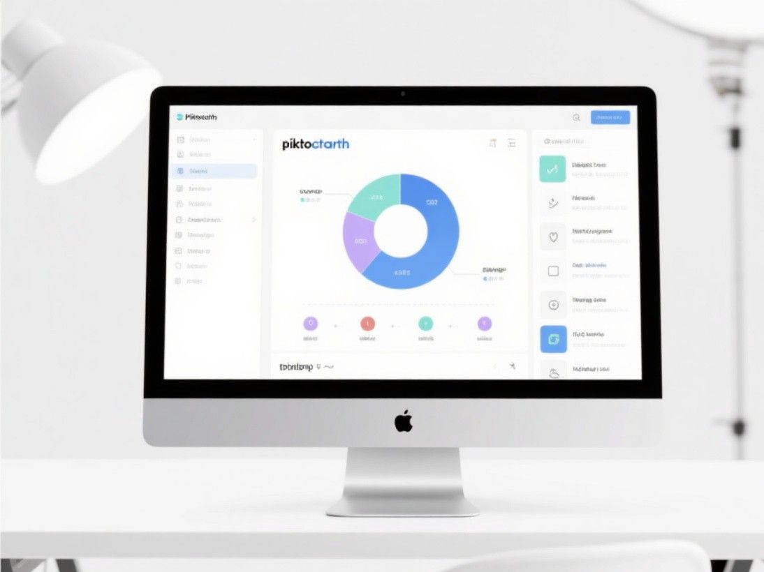
Piktochart includes built-in chart tools for bar charts, line charts, pie charts, donut charts, area charts, and scatter plots. Click "Charts" in the left sidebar, select the chart type, and enter your data. Piktochart generates the chart and inserts it into your infographic. You can then customize the chart colors, labels, and legend to match your design.
For non-chart data, use Piktochart's icon library. The platform includes over 10,000 icons organized by category. Icons are effective for representing statistics visually—for example, a person icon next to "75% of users" or a globe icon next to "Available in 40 countries." Keep icon usage consistent: if you use outlined icons in one section, use outlined icons throughout the entire infographic.
Piktochart also supports maps. If your data has a geographic component, use the map block to create a choropleth map or place markers on specific locations. This adds a visual dimension that text alone cannot provide.
Step 5: Add Visual Hierarchy and Flow
A professional infographic guides the reader through the information in a logical sequence. Use size contrast to create hierarchy: your main title should be the largest text element, section headings should be medium-sized, and body text should be the smallest. Piktochart's block system makes this easy—each section is a separate block that you can resize independently.
Add visual connectors between sections. Piktochart includes arrow graphics, divider lines, and dotted paths that help the reader's eye flow from one section to the next. Without these connectors, infographics can feel like a collection of disconnected cards rather than a cohesive story.
White space is critical. Do not fill every pixel with content. Leave breathing room between sections so the reader can process each data point before moving to the next. Piktochart templates generally handle this well, but as you add custom content, you may need to adjust spacing manually.
Step 6: Export and Share
When your infographic is complete, click "Download" in the top right corner. Piktochart offers PNG (for web and social media), PDF (for print and email), and PPT (for presentations) export options. The free tier downloads at standard resolution; Pro users get high-resolution files suitable for large-format printing.
Piktochart also provides a shareable link for online viewing. This is useful when you want to embed the infographic in a blog post or share it with colleagues for review. The online version is responsive, meaning it adapts to different screen sizes automatically.
For SEO purposes, when embedding an infographic on your website, include a text transcript below the image. Search engines cannot read the text inside an image file, so the transcript ensures your data is indexed and accessible.