Best Tools for Designing Mobile App Interfaces

What a Style Guide Contains
A brand style guide (also called a brand guidelines document or brand book) is a reference document that defines how your brand looks, sounds, and communicates across all touchpoints. It typically includes: logo usage rules, color palette with hex codes, typography specifications, imagery style guidelines, iconography style, voice and tone guidelines, and examples of correct and incorrect usage. The purpose is to ensure that anyone who creates content for your brand—employees, agencies, freelancers—produces work that is visually and verbally consistent.
Choosing a Format for Your Style Guide
Style guides can be created as PDF documents, web pages, Figma files, or dedicated brand management platforms. PDFs are the most common format because they are easy to share and view offline. Web-based style guides (hosted on platforms like Frontify, Brandpad, or a custom URL) are more accessible and can be updated without redistributing files. Figma files work well for design teams that already use Figma, because the style guide can include live components that designers can copy directly into their projects.
For this guide, I will describe the content and structure of a style guide regardless of format. The same sections apply whether you create a PDF in InDesign, a web page in Frontify, or a Figma file with component documentation.
Section 1: Logo Usage
Define every version of your logo and the rules for using each one. Include: the full logo (icon + wordmark), the icon alone, the wordmark alone, horizontal and vertical layouts, one-color versions (black, white, reversed), and minimum size requirements. Show clear space rules (the minimum amount of empty space around the logo, typically defined as a proportion of the logo's height). Show incorrect usage examples: stretching the logo, rotating the logo, placing it on a low-contrast background, changing the logo colors, adding effects (drop shadows, gradients, outlines) to the logo.
Provide downloadable logo files in every needed format: SVG (for web), PNG (for digital), PDF (for print), EPS (for large-format print), and JPG (for email signatures and applications that do not support transparency). Organize the files in a shared folder (Google Drive, Dropbox, or a brand management platform) with clear naming conventions: "logo-full-color.svg," "logo-icon-white.png," "logo-horizontal-black.pdf."
Section 2: Color Palette
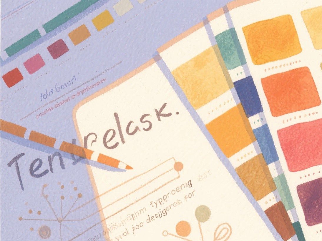
List every brand color with its hex code (for web), RGB values (for digital screens), CMYK values (for print), and Pantone number (for professional printing). Define the primary color (used most frequently, typically 60% of visual real estate), secondary color (used for accents, 30%), and accent color (used sparingly for highlights and CTAs, 10%). Include light and dark variants of each color for different background contexts.
Show color accessibility information. For each color combination used for text on a background, provide the WCAG contrast ratio and indicate whether it passes AA or AAA standards. This section is increasingly important as accessibility regulations become stricter. Tools like WebAIM's Contrast Checker can calculate these ratios for you.
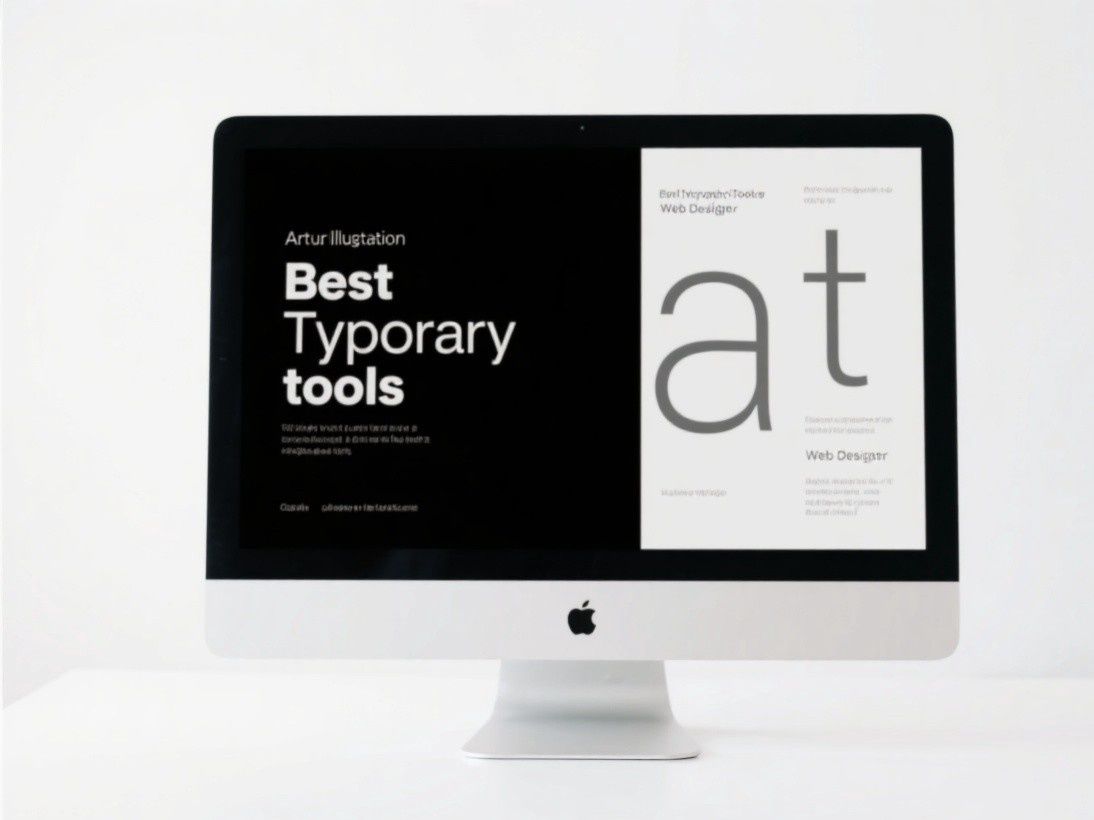
Section 3: Typography
Specify the primary typeface (used for headings and body text), the secondary typeface (used for captions, labels, and supplementary text), and any display typefaces (used for special occasions like campaign graphics). For each typeface, define the font weights you use (Regular, Medium, Bold, etc.), the size scale (heading 1: 48px, heading 2: 36px, body: 16px, caption: 12px), the line height (typically 1.4-1.6 for body text), and the letter spacing (typically -0.02em for large headings, 0 for body text).
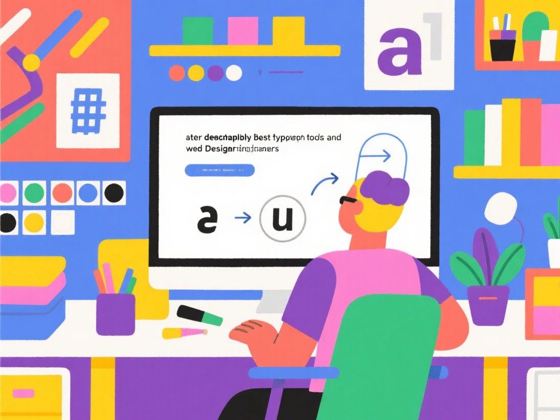
Show examples of correct typography: a paragraph of body text with proper line height, a heading hierarchy showing all heading levels, and a sample layout demonstrating how the typefaces work together. Also show incorrect usage: using more than two typefaces, using decorative fonts for body text, and setting body text too small or too large.
Section 4: Imagery and Photography Style
Define the visual style for photographs and illustrations used in your brand materials. Specify whether your brand uses photography, illustration, or both. If photography, describe the style: candid or posed, bright or moody, close-up or environmental, natural lighting or studio lighting. Provide example images that demonstrate the desired style alongside images that do not fit the brand (marked as "avoid").
If you use illustrations, define the illustration style: flat, line art, 3D, hand-drawn, geometric. Specify the color palette for illustrations (which brand colors to use, whether to use a limited palette or full color), the level of detail (minimal or detailed), and any recurring elements (specific character styles, background treatments, border styles).
Section 5: Voice and Tone
Describe how your brand communicates in writing. Define three to five brand voice attributes (for example: "professional but approachable," "concise but informative," "confident but not arrogant"). For each attribute, provide a brief explanation and examples of copy that embodies it. Include a "do" and "don't" list: "Do use active voice. Don't use jargon. Do address the reader directly. Don't use corporate speak."
Tools for Creating Style Guides
Frontify is a dedicated brand management platform that hosts your style guide online with interactive elements (color swatches that copy hex codes on click, downloadable asset packages, component libraries). Pricing starts at $199 per month. Brandpad offers similar functionality at a lower price point, starting at $25 per month. For budget-conscious teams, a well-designed PDF created in Canva, Figma, or Google Docs serves the same purpose without subscription costs. The format matters less than the content—what matters is that the guide is comprehensive, clear, and accessible to everyone who creates content for your brand.
Prototyping Interactive Elements in Mobile Design
Static mockups cannot fully communicate how a mobile app will feel to use. Interactive prototyping bridges this gap by allowing stakeholders to tap through screens, experience transitions, and interact with UI elements before any code is written. Figma's prototyping features let you define tap targets, swipe gestures, scroll behaviors, and transition animations between frames. For more complex interactions, tools like ProtoPie and Principle offer advanced animation capabilities including physics-based motion, conditional logic, and variable-driven interactions. When prototyping, focus on the critical user flows: onboarding, core task completion, and error recovery. These three flows determine whether users will adopt and retain your app. Test your prototypes with real users by sharing a clickable link — Figma, InVision, and Marvel all support this. Watch where users tap, where they hesitate, and where they get confused. These observations are far more valuable than any feedback gathered from reviewing static screenshots.