Best SVG Editors for Web Designers and Developers
What a Website Mockup Is (and Is Not)
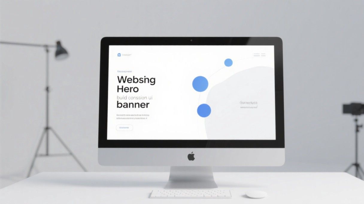
A website mockup is a visual representation of what a website will look like before it is built. It is not a functional website—you cannot click links or fill forms in a mockup. It is a design document that communicates layout, color scheme, typography, and content structure to developers, clients, and stakeholders. The tools in this guide let you create professional-looking mockups using drag-and-drop interfaces, pre-built templates, and AI assistance—no design training required.
Figma: Start With a Free Template
Figma's free tier is sufficient for creating website mockups. The key is to start with a community template rather than a blank canvas. Open Figma, go to the Community tab, and search for "website mockup" or "landing page template." You will find thousands of free templates from professional designers, organized by industry and style.
Choose a template that matches the type of website you need: SaaS landing page, portfolio, e-commerce, blog, agency, restaurant, or startup. Download the template to your Figma workspace and open it. The template will include multiple frames (pages) with pre-designed layouts for the homepage, about page, services page, and contact page.
Customize the template by replacing the placeholder content. Click on any text element and type your own text. Click on any image and replace it with your own photo (upload from your device or use Unsplash, which is integrated into Figma's image search). Change the colors by selecting elements and modifying the fill color in the right panel. The template's design system ensures that your changes maintain visual consistency even if you do not know design principles.
Wix and Squarespace: Visual Website Builders With Built-In Design
Wix and Squarespace are website builders, not mockup tools, but they serve a similar purpose for people who want to see their website design without hiring a designer. Both platforms provide templates that you can customize with a visual editor, and the result is a live website rather than a static mockup.
Wix offers over 900 templates across 70+ categories. The editor uses drag-and-drop functionality: you can move any element anywhere on the page, resize it, change its style, and add new elements from a panel. Wix's AI website builder (ADI) can generate a complete website based on answers to a few questions about your business, which is useful if you want a starting point without browsing templates manually.
Squarespace is known for its design quality. The templates are fewer (around 120) but more polished than Wix's. Squarespace's editor is more structured—you cannot drag elements freely, which prevents layout mistakes but also limits flexibility. For people without design skills, this constraint is actually helpful because it enforces good layout practices.
Penpot: The Open-Source Figma Alternative for Mockups
Penpot is a free, open-source design tool that runs in the browser and provides functionality similar to Figma. It supports vector editing, components, auto layout, and prototyping. Penpot uses SVG as its native format, which means your designs are always standards-compliant and can be exported directly as web-ready SVGs.
For website mockups, Penpot offers a library of community templates and UI kits. The interface will feel familiar to anyone who has used Figma: canvas in the center, layers panel on the left, properties panel on the right. Penpot's advantage is that it is completely free and self-hostable—if your organization prefers open-source tools or has data sovereignty requirements, Penpot is the best option.
Relume: AI-Powered Website Wireframe Generator
Relume is a specialized tool for generating website wireframes and sitemaps. Describe your business and website goals, and Relume generates a complete sitemap with page hierarchy, followed by wireframe layouts for each page. The wireframes include content blocks for hero sections, feature grids, testimonials, pricing tables, FAQs, and footers—all structured according to proven conversion-focused layouts.
Relume's wireframes are not visually designed—they show structure and content placement in gray boxes and placeholder text. You can then import the wireframe into Figma or Webflow and apply visual design. This separation of structure and visual design is helpful for beginners because it lets you focus on content organization first and visual styling second.
Relume offers a free tier with limited generations and a Pro plan at $19 per month for unlimited wireframe generation, Figma and Webflow integration, and client sharing features. For freelancers and small agencies that need to produce website mockups quickly, Relume significantly reduces the time from brief to wireframe.
Tips for Non-Designers Creating Mockups
Stick to one font family. Using multiple fonts is one of the most common mistakes beginners make. Choose one font that has multiple weights (regular, medium, bold) and use weight variations to create hierarchy. Google Fonts offers hundreds of free fonts with multiple weights—Inter, Roboto, and Open Sans are safe choices for body text.
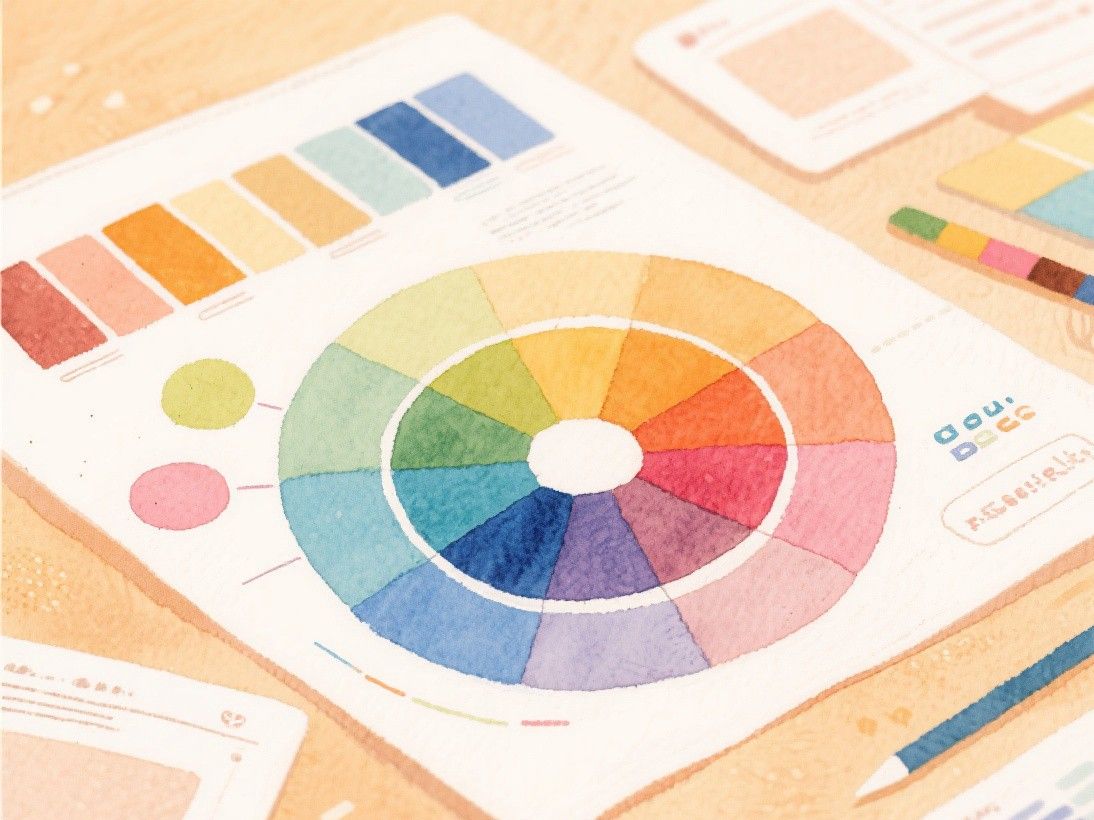
Use a maximum of three colors. One color for backgrounds (usually white or light gray), one color for text (usually dark gray or black), and one accent color for buttons and highlights. If you need more visual variety, use lighter and darker shades of your accent color rather than introducing additional colors.
Leave plenty of white space. Beginners tend to fill every inch of the screen with content. White space (empty space between elements) improves readability and makes the design look professional. If a section feels cramped, add more padding and margin until it breathes.
Study websites you admire. When you see a website that looks good, take a screenshot and analyze it: how much space is between the header and the content? How wide is the text column? How large are the headings compared to body text? Replicate these proportions in your mockup. Good design is often about proportions, and studying real examples teaches you what proportions work.
SVG Optimization Techniques for Web Performance
SVG files can balloon in size if not optimized properly, which directly impacts page load speed. Before publishing any SVG, run it through an optimization tool like SVGO (SVG Optimizer), which removes unnecessary metadata, minifies path data, and strips editor-specific attributes that add file size without visual benefit. Common optimizations include converting grouped elements to single paths, removing hidden layers, simplifying decimal precision in coordinate data, and collapsing redundant group elements. For SVGs used as icons on a website, consider inlining them directly in the HTML rather than loading them as external files. Inline SVGs eliminate an HTTP request and can be styled with CSS, allowing you to change colors and sizes without creating multiple file versions. For larger SVGs like illustrations and diagrams, use the SVG sprite technique to combine multiple icons into a single file and reference individual icons by ID. Test your optimized SVGs across browsers, as some optimization techniques can cause rendering differences in older versions of Safari or Edge.