Color Palette Generators: Find the Perfect Colors for Your Project
Why Color Palette Generators Save Time and Improve Results
Choosing colors by guessing or randomly picking from a color wheel rarely produces harmonious results. Color palette generators apply established color theory rules—complementary, analogous, triadic, split-complementary—to generate combinations that look balanced and intentional. Using these tools eliminates the trial-and-error process and gives you a starting palette that you can refine to match your project's needs.
Coolors.co: The Fastest Palette Generator
Coolors is the most popular online color palette generator, and for good reason. Press the spacebar, and it generates a new five-color palette instantly. Press it again, and another palette appears. You can lock individual colors that you like and continue generating to find complementary colors for the ones you have locked.
Coolors supports several color harmony modes: complementary (opposite colors on the wheel), analogous (adjacent colors), triadic (three evenly spaced colors), and tetradic (four colors in two complementary pairs). Switch between modes using the menu at the top of the page. Each generated palette displays the hex code, RGB values, and a contrast checker that shows whether text is readable against each color background.
The contrast checker is particularly useful for web design. It calculates the WCAG (Web Content Accessibility Guidelines) contrast ratio between any two colors in your palette and tells you whether the combination passes AA or AAA standards. This helps you avoid the common mistake of choosing beautiful colors that fail accessibility requirements.
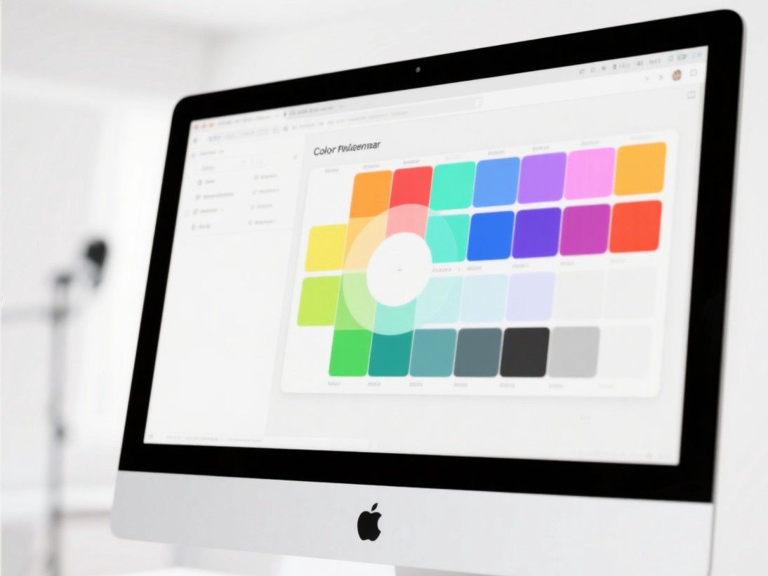
Coolors also lets you upload an image and extract a palette from it. This is valuable when you want to match a color scheme to an existing photograph or brand asset. The extracted colors are not always perfect—you may need to adjust them manually—but they provide a solid starting point. Export options include URL sharing, PNG, SVG, PDF, and code snippets (CSS, SCSS, XML).
Adobe Color: Integration With Creative Cloud
Adobe Color (formerly Adobe Kuler) integrates directly with Photoshop, Illustrator, and other Creative Cloud applications. You can create palettes on the Adobe Color website and access them instantly from the Color panel in any Adobe app. This integration is the main reason to use Adobe Color over alternatives if you already work in the Adobe ecosystem.
The tool offers several generation methods. The color wheel mode lets you select a harmony rule and drag a point around the wheel to see the palette update in real time. The extract from image mode works like Coolors' image extraction. The accessibility tools mode generates palettes that meet specific contrast requirements.
Adobe Color also includes a "Trends" section that shows popular color combinations used by the Creative Cloud community. Browsing these trends can provide inspiration and help you understand current color preferences in different industries. You can save unlimited palettes to your Adobe account and organize them into themes or projects.
Colormind: AI-Powered Palette Generation
Colormind uses a neural network trained on photographs, movies, and popular designs to generate color palettes. Unlike rule-based generators that apply fixed color theory formulas, Colormind produces combinations that feel more organic and less formulaic. The palettes often include unexpected color pairings that work because the AI has learned from millions of real-world examples.
You can generate palettes from scratch, customize individual colors by clicking on them, or extract palettes from uploaded images. Colormind also offers a "learn from" feature where you can select a specific dataset—photography, art, fashion, or graphic design—and the AI will generate palettes in that style. This is useful when you want a palette that matches a particular aesthetic rather than a generic harmonious combination.
Color Hunt: Community-Curated Palettes
Color Hunt is a curated collection of color palettes submitted by designers. Each palette is tagged with keywords (warm, pastel, neon, earth, minimal) and organized by popularity and date. The site is a goldmine for inspiration when you are not sure what direction to take.
Browse by popularity to see what the design community favors, or use the search and filter system to find palettes that match your project's mood. Click the heart icon to save favorites to your collection. Each palette page shows the hex codes and provides a quick-copy button. Color Hunt also offers a "Random" button for serendipitous discovery.
The limitation of Color Hunt is that you cannot customize the palettes—you use them as-is or recreate them in another tool for modification. Think of it as a mood board for colors rather than a generation tool.
Practical Tips for Using Generated Palettes
Generated palettes are starting points, not final answers. After generating a palette, apply the 60-30-10 rule: use your primary color for 60% of the design (backgrounds, large areas), your secondary color for 30% (headers, sidebars, accent areas), and your accent color for 10% (buttons, links, highlights). This ratio creates visual balance without overwhelming the viewer.
Test your palette in context. A palette that looks beautiful in a color swatch may not work when applied to actual content. Create a mockup of your design—whether it is a website, social media post, or presentation—and apply the colors to see how they interact with text, images, and white space. Adjust individual colors as needed.
Consider the emotional associations of your colors. Blue conveys trust and professionalism (good for finance and healthcare). Green suggests growth and sustainability (good for environmental and wellness brands). Orange and yellow communicate energy and optimism (good for food and entertainment). Red signals urgency and passion (good for sales and calls to action). Choose a palette that aligns with the message you want to communicate, not just one that looks aesthetically pleasing.
Finally, document your palette with hex codes, RGB values, and usage guidelines. Share this documentation with your team so everyone uses the same colors consistently. Tools like Coolors and Adobe Color make this easy with their export features, which generate ready-to-use code snippets and style sheets.