How to Color Grade Your Videos Like a Professional

Color Correction vs. Color Grading
Color correction and color grading are two distinct steps in the post-production pipeline, though they are often confused. Color correction is the technical process of adjusting your footage to look natural and consistent. It involves setting the correct white balance, exposure, contrast, and saturation so that the image accurately represents what was filmed. Color grading is the creative process that follows correction, where you apply a specific look or mood to your footage. Grading might involve making shadows cooler (bluer), adding warmth to skin tones, increasing contrast for a dramatic look, or desaturating colors for a muted, film-like aesthetic.
Always perform color correction before color grading. Correcting first ensures that your starting point is consistent across all clips, which makes the creative grading process more predictable and controllable. If you grade before correcting, changes in exposure or white balance will alter the look you applied, requiring you to re-grade. Most professional workflows follow the order: edit, correct, grade, export.
Using DaVinci Resolve's Color Page
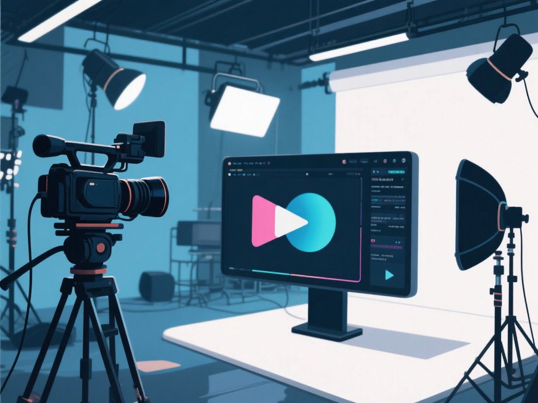
DaVinci Resolve is widely regarded as the best color grading tool available at any price point. The Color page provides a comprehensive set of tools organized into a logical workflow. At the top of the page, the Nodes panel shows your grading pipeline as a flowchart. Each node represents a set of adjustments applied in sequence. The default setup starts with a single node, but you can add multiple nodes to build complex grades layer by layer.
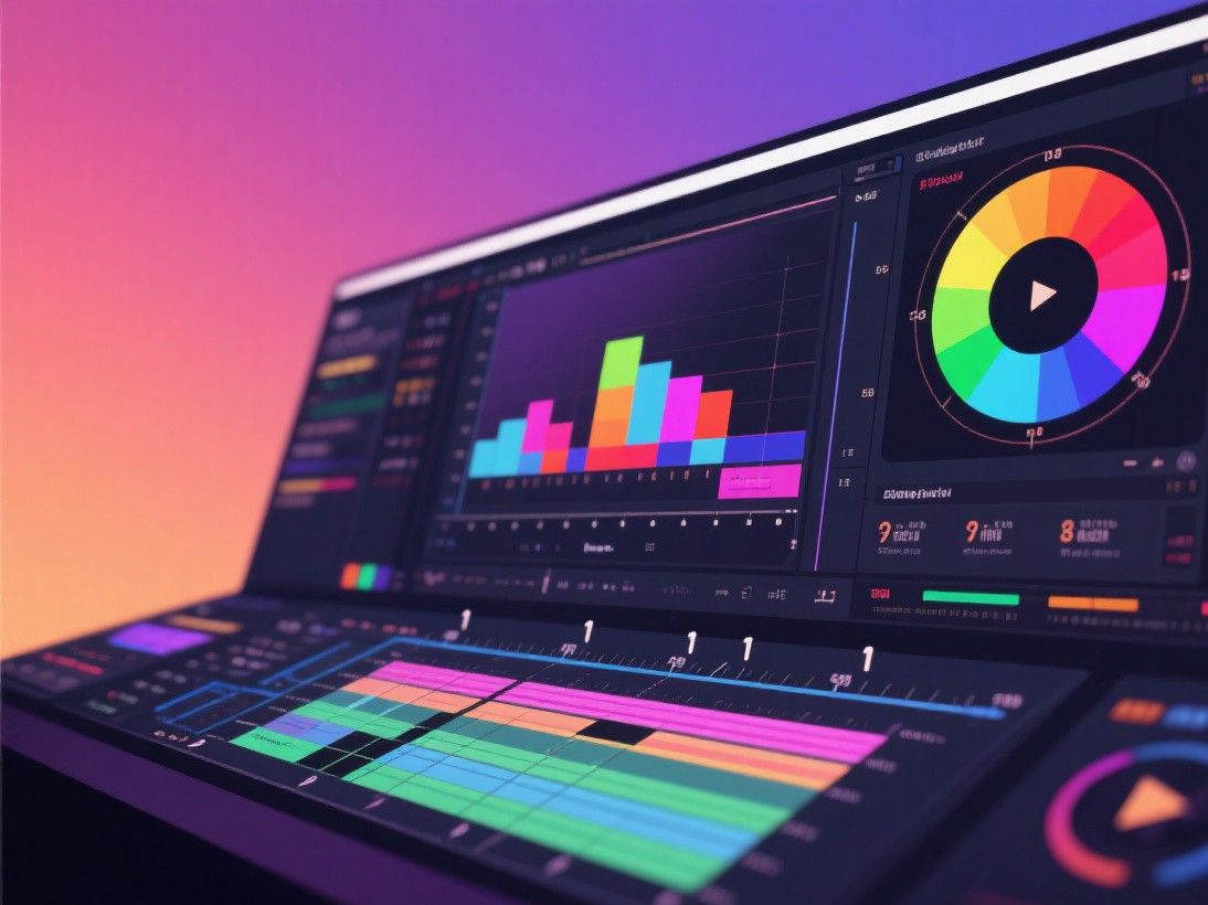
The primary correction tools are located in the bottom-left panel. The color wheels (Lift, Gamma, Gain) control the tonal range of the image. Lift adjusts shadows, Gamma adjusts midtones, and Gain adjusts highlights. Dragging the wheel toward a color shifts that tonal range in that direction. The Log wheels provide more control for footage shot in a log color profile, which is common on cinema cameras. The offset wheel shifts the entire image uniformly, which is useful for removing color casts.
The scopes panel (bottom-right) displays real-time analysis of your image. The waveform monitor shows luminance values from dark to light. The vectorscope shows color distribution. The histogram shows the distribution of tonal values. The parade scope shows RGB channels individually. Using scopes ensures your corrections are technically accurate rather than relying on the subjective appearance of your monitor, which may not be calibrated.
Building a Professional Grade Step by Step
Start with white balance correction. Use the temperature and tint controls to neutralize any color cast in your footage. If the image looks too warm (yellow/orange), reduce the temperature. If it looks too cool (blue), increase it. Tint adjusts the green-magenta axis. The goal is to make white objects in your scene appear truly white. Use the vectorscope to verify: neutral colors should cluster around the center point.
Next, set your exposure using the Lift, Gamma, and Gain wheels or the contrast and pivot controls. The waveform monitor should show shadows near 0 IRE (but not below), highlights near 100 IRE (but not above), and midtones distributed across the middle range. Skin tones should fall between 55-70 IRE on the waveform. Adjust the contrast slider to expand or compress the tonal range, and use the highlights and shadows sliders to recover detail in bright and dark areas.
After correction, add a second node for creative grading. Common grading techniques include: the orange and teal look (pushing shadows toward teal and skin tones toward orange for a cinematic contrast), the bleach bypass look (high contrast with desaturated colors for a gritty feel), and the cross-processed look (shifting colors in opposite directions for an artistic effect). Each look is achieved by adjusting the color wheels, curves, and qualifiers in the second node. Save your grade as a preset to apply it consistently across all clips in your project.
Working With LUTs
LUTs (Look-Up Tables) are pre-built color transformations that can be applied to your footage to achieve specific looks. A LUT maps input color values to output color values, essentially applying a color grade in a single step. LUTs are available in two types: technical LUTs that convert log footage to a standard color space (like Rec.709), and creative LUTs that apply a specific artistic look.
To use a LUT in DaVinci Resolve, open the LUT panel in the Color page, right-click, and select "Add Custom LUT." Navigate to your LUT file (typically a .cube file) and import it. Then, in your node, click the LUT dropdown and select the imported LUT. The LUT is applied before any manual adjustments in that node, so you can still fine-tune the result using the color wheels and other tools.
Many free LUTs are available online from sites like PremiumBeat, RocketStock, and Lutify.me. When using LUTs, remember that they are designed for specific input conditions. A LUT created for Sony S-Log3 footage will look different when applied to Canon C-Log footage because the starting color profiles are different. For the most predictable results, use technical LUTs to normalize your footage first, then apply creative LUTs on top of the normalized image.
Matching Shots Across a Scene
Consistency is the hallmark of professional color grading. When multiple shots in a scene were filmed at different times or with different camera settings, the color and exposure may vary between cuts. DaVinci Resolve provides several tools for shot matching. The shot match feature (available in the Color page toolbar) analyzes a reference frame and automatically adjusts the current frame to match its color and exposure. This works well as a starting point, though manual fine-tuning is usually needed.
For manual matching, use the split-screen view to display the reference shot and the shot you are adjusting side by side. Toggle between the two views while adjusting the color wheels until they match. Use the scopes to verify that luminance and color values are consistent between shots. Group similar shots and apply the same grade to all of them, then make individual adjustments as needed. This group-and-adjust workflow is faster than grading each shot independently and produces more consistent results.
Color Grading for Different Video Genres
Different types of video content benefit from different grading approaches. Corporate and business videos typically use clean, natural grading with accurate skin tones, moderate contrast, and minimal color manipulation. The goal is professionalism and trustworthiness.
Music videos and fashion content allow for more aggressive and stylized grading. High contrast, saturated colors, and unconventional color choices (like shifting shadows to purple or teal) create visual impact that matches the energy of the content. Horror and thriller content uses desaturation, cool color temperatures, and deep shadows to create unease. Food and cooking videos benefit from warm, slightly saturated grading that makes food look appetizing. Understanding these genre-specific conventions helps you choose grading approaches that support your content's purpose and meet audience expectations.