How to Design a Professional Business Card Online
What Midjourney Can and Cannot Do for UI Design
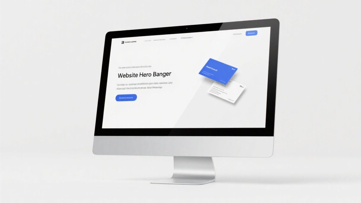
Midjourney generates images from text descriptions, and it is remarkably good at producing visual concepts that look like real user interfaces. However, it cannot produce functional, pixel-perfect designs. The generated images are approximations—they show layout ideas, color schemes, and visual styles, but the text is gibberish, the spacing is inconsistent, and the elements cannot be directly exported as design files. Use Midjourney for inspiration and moodboarding, not as a replacement for Figma or Sketch.
Midjourney operates through Discord. You type prompts in a channel, and the bot generates four image options. You can upscale (increase resolution) any option, create variations, and remix with modified prompts. A basic subscription costs $10 per month for 200 image generations, and a Pro subscription at $30 per month provides 15 hours of fast generation plus unlimited relaxed generation.
Crafting Effective UI Design Prompts
The quality of Midjourney's output depends entirely on your prompt. Vague prompts like "mobile app design" produce generic results. Specific prompts that include platform, style, color palette, and content type produce much more useful results. Here is a prompt structure that works well for UI design:
[Platform] [App Type] UI design, [Style Description], [Color Palette], [Specific Screen], [Additional Details]
For example: "iOS fitness tracking app UI design, minimalist flat design with rounded corners, dark mode with neon green accents (#00FF88), home screen with daily activity rings and workout summary cards, clean sans-serif typography, status bar visible, iPhone 14 Pro frame."
This prompt specifies the platform (iOS), the app category (fitness tracking), the visual style (minimalist flat with rounded corners), the color scheme (dark mode with neon green), the specific screen (home screen with activity rings), and additional details (clean typography, status bar, device frame). The more specific you are, the closer the output will match your vision.
Generating Dashboard and Web Interface Concepts
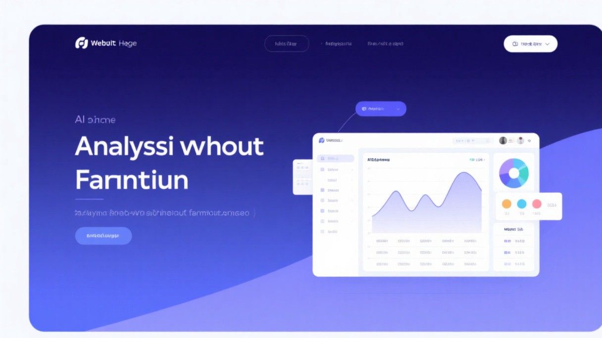
Midjourney excels at generating dashboard layouts. Dashboards have a distinctive visual structure—sidebar navigation, header bar, data cards, charts, and tables—that the AI has learned to reproduce convincingly. A good prompt for a dashboard: "web analytics dashboard UI, light theme with white background and blue accent (#2563EB), sidebar navigation with icons, top header with search bar and user avatar, main content area with line chart, bar chart, and data table cards, clean modern design, Dribbble style, 4K."
The "Dribbble style" modifier is particularly effective. It tells Midjourney to produce images that look like the polished, presentation-quality designs commonly found on Dribbble. Other useful style modifiers include "Behance style" (more detailed and realistic), "minimalist" (clean with lots of white space), and "glassmorphism" (frosted glass effects with blur and transparency).
Using Generated Images as Design References
After generating a set of UI concepts, select the ones that best match your direction and bring them into your actual design tool. In Figma, create a "References" frame and paste the Midjourney images. Use the Eyedropper tool to sample colors from the generated images. Study the layout proportions and recreate them with proper spacing and alignment in your wireframe.
This workflow—generate concepts in Midjourney, study the visual direction, then build the actual design in Figma—combines the speed of AI generation with the precision of professional design tools. You can explore ten different visual directions in Midjourney in the time it would take to mock up two in Figma, then invest your Figma time in the direction that works best.
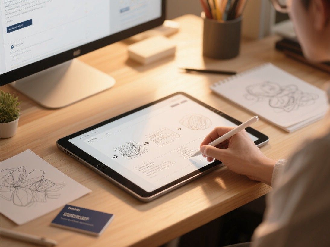
Generating Landing Page and Marketing Site Concepts
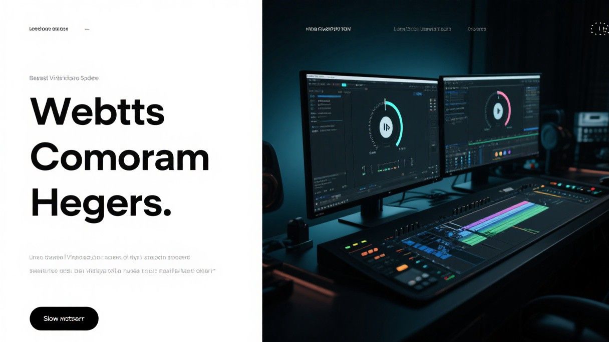
Midjourney is also useful for generating landing page concepts. A strong prompt: "SaaS landing page design for a project management tool, hero section with headline text placeholder, feature grid with icons, pricing table with three tiers, testimonials section with avatar cards, footer with links, light background with purple gradient accents, modern clean design, desktop view."
The generated image will not have readable text, but it will show you a complete layout with visual hierarchy, section spacing, and element sizing. You can use this as a structural reference when building the actual landing page in a tool like Webflow, Framer, or HTML/CSS.
Advanced Techniques: Image Prompts and Style References
Midjourney supports image prompts alongside text prompts. Upload a screenshot of an existing UI design that you like, copy the image URL, and include it in your prompt with a weight parameter. For example: "[image URL] modern fintech app redesign, lighter color scheme, rounded buttons, --iw 0.5." The --iw parameter controls how much the image influences the output (0 to 2, with 1 being the default). This technique lets you take an existing design and explore variations.
You can also use Midjourney's style reference feature (--sref) to maintain consistency across multiple generations. After generating an image you like, copy its seed number (visible in the generation details), and include --seed [number] in subsequent prompts. This produces images with a similar visual style, which is useful when you need a consistent look across multiple screens of the same app.
Limitations and Ethical Considerations
Midjourney cannot generate accurate text. Any text in the generated images will be nonsensical letterforms that look like a language but are not. Do not use Midjourney-generated UI images in client presentations without clearly labeling them as AI-generated concepts, not final designs. Clients may not understand the distinction and may expect the final product to match the AI output exactly.
Be aware that Midjourney's training data includes designs from real designers on platforms like Dribbble and Behance. The generated images may inadvertently reproduce specific designers' styles or elements. Use Midjourney for inspiration and direction-finding, not for copying specific designs. The goal is to accelerate your creative process, not to replace the creative thinking that makes good design valuable.
Choosing the Right Paper Stock and Finish
The physical quality of your business card matters as much as the design. Paper weight is measured in grams per square meter (GSM), and standard business cards range from 300 to 400 GSM. A 350 GSM card feels substantial without being uncomfortably thick. For a premium impression, consider 400 GSM or even layered cards with a colored edge. The finish affects both appearance and texture: matte finishes convey sophistication and are easier to write on, while glossy finishes make colors pop but can show fingerprints. A soft-touch velvet finish has become increasingly popular for tech and creative professionals because it feels unique and memorable. Spot UV coating lets you apply gloss to specific elements of the card — your logo or name, for example — while keeping the rest matte. This contrast draws attention to key elements. When ordering from online printers like Moo, Vistaprint, or GotPrint, always order a physical sample pack first. Colors look different on screen than on paper, and the tactile experience of holding the actual card cannot be evaluated digitally.